Sissle & Daughters
Location: Portland, ME
Project: Brand design and development for two physical shops.
Role: Lead Designer
Company: Helm Digital - First Pier Division
Process Overview
Moodboards ————> Logo Development ————> Final Logo System ————> Color & Typography ————> Pattern ————> Brand Guide
MoodboardS
-
Below is a custom moodboard created for Sissle & Daughters at the beginning of their brand journey. Not only did this moodboard have to capture the essence of their existing shop, it also had to capture the vibe of their new location! Sissle ended up moving forward with 1. Paris Bistro!

PARIS BISTRO - This concept captures the lively essence of an afternoon walking around Paris, where every corner brims with charm and character. Colors are bright and energetic (French blue, orangey-red, and chartreuse). Illustrations are loose and gestural, bringing a sense of spontaneity and fluidity. Typefaces feature playful scripts and modern sans serifs. Photographic style is on the minimal side using more direct sunlight, emphasizing both bright colors and shadows.
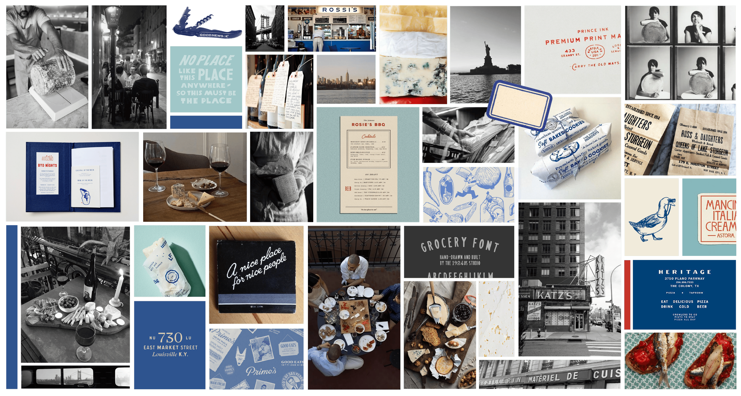
NYC DELI - This concept captures the timeless charm of a New York delicatessen, where classic meets craft and an inviting atmosphere makes you feel right at home. The color palette is anchored by French blue and teal. The illustrations are more detailed and feature more line work, while still being playful. Typefaces are classic vintage-inspired options. Photographic style is grittier, black and white, capturing the essence of the Big Apple.
Logo development
-
We went through a range of different wordmarks and illustrations, testing various styles, weights and typefaces. Typographically, the through line was a subtle delicatessen vibe with a secondary type that felt strong and well-balanced.For the illustration, our goal was to create a memorable drawing of their daughters, Harriet and Tess, each holding a food that they sell (i.e., Tess with a wheel or wedge of cheese, & Harriet with a loaf of bread under her arm), with them portrayed as 4-5 years old. After two rounds of edits we were able to bring their vision to life!


final logo system
-
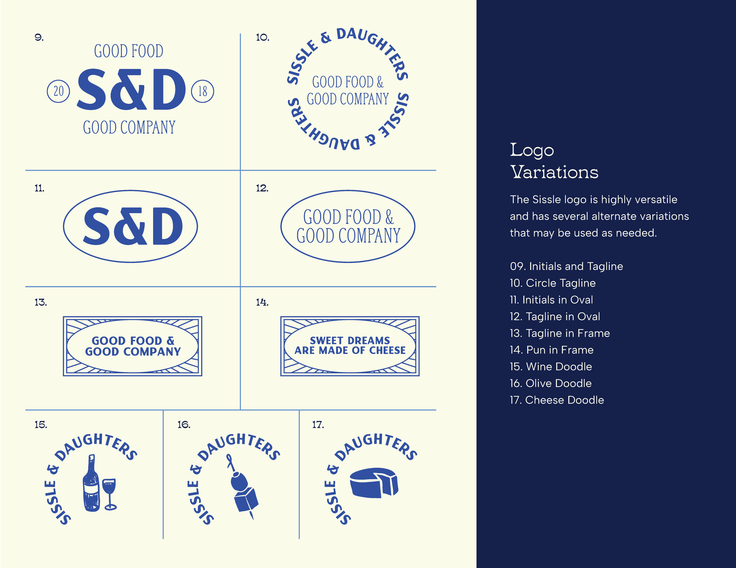
The final result was a logo that felt honest, tasteful, and timeless. It included the girls, Harriet and Tess, side by side. Not only does the illustration feature cheerful expressions and cute outfits - it will be able to age with the daughters throughout their lives, always representing their dynamic and personalities! Beyond the main logo, I created a vast amount of variations to use throughout their branding. Taking inspiration from the chosen moodboard which included vintage signage and playful illustrations! Below are just some of my favorites!


color and typography
-
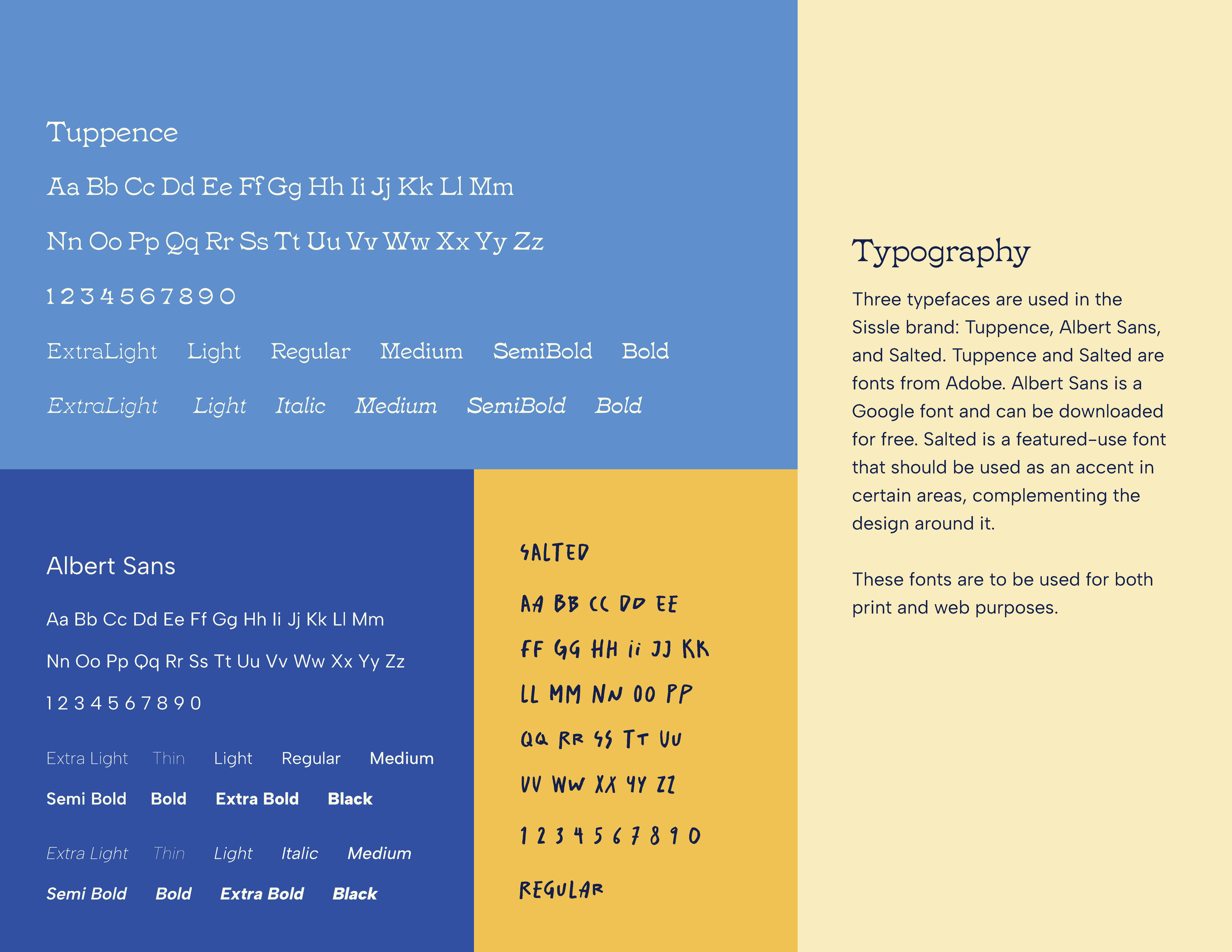
After just one round, Sissle was able to select their colors and typography from a solid line-up of options! Fellow designer, Haley, worked on the colors while I focused on type. The final choice spoke to brand attributes like classic, energetic, not pretentious, and inspired. These colors are bold and bright, and at the same time, very timeless and French — picture a striped blue shirt, french red lip, dijon mustard… They’re sophisticated and polished without feeling stuffy or taking things too seriously, and they give off energy and passion to inspire customers. The final typography selection consisted of a funky, serif headline, an easy to read, sans-serif paragraph, and a handwritten accent!


Pattern
-
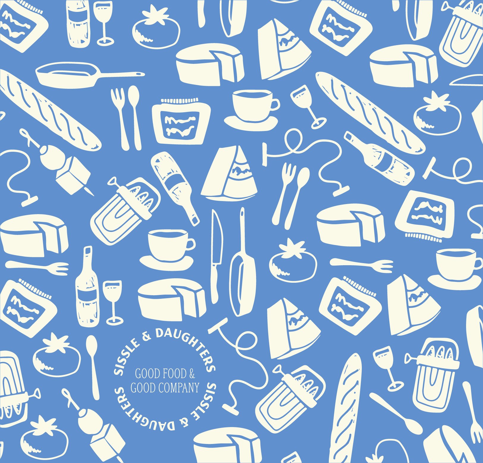
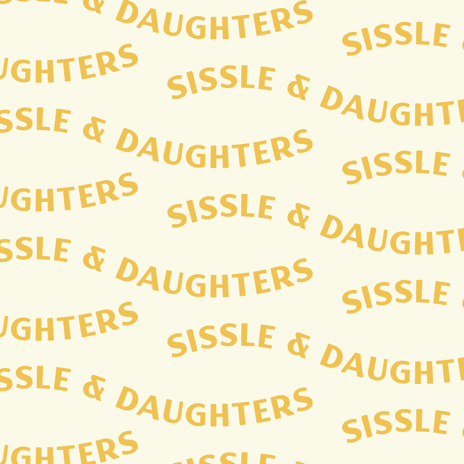
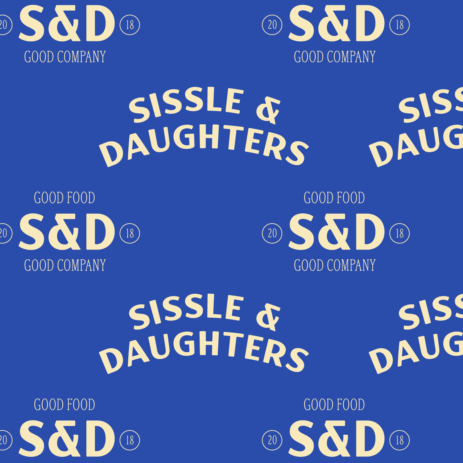
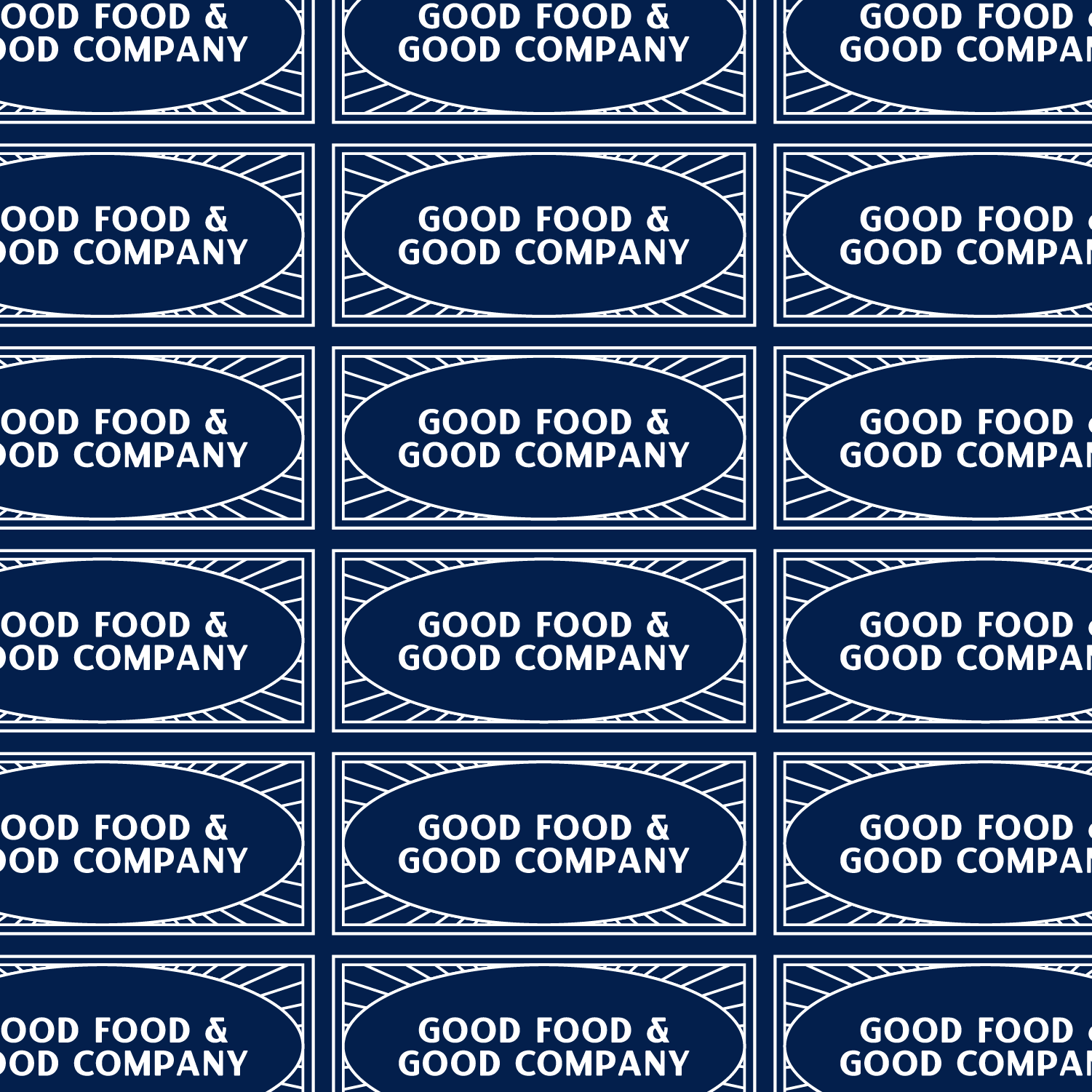
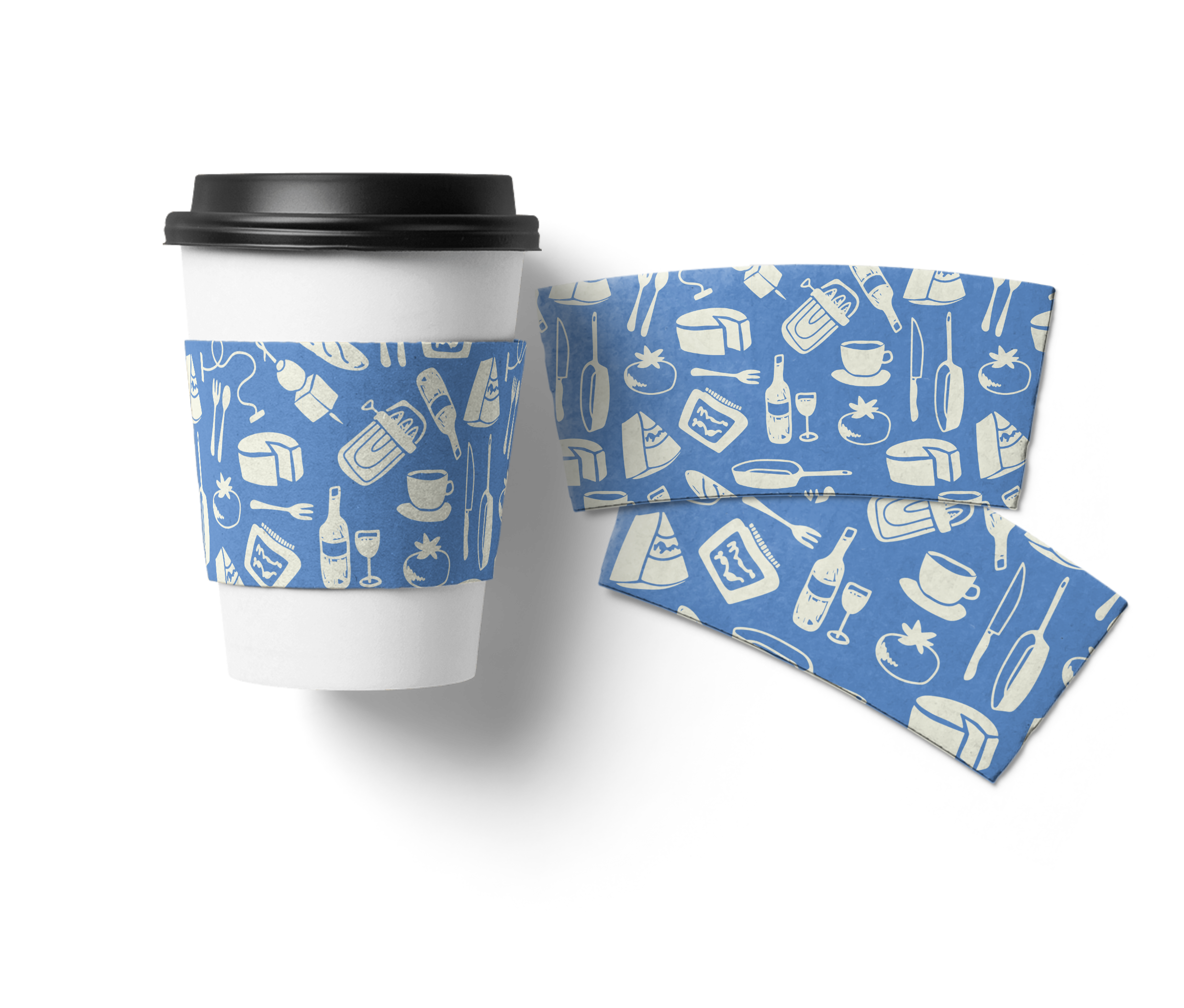
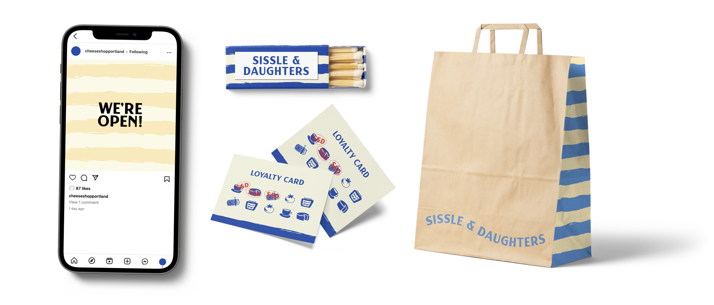
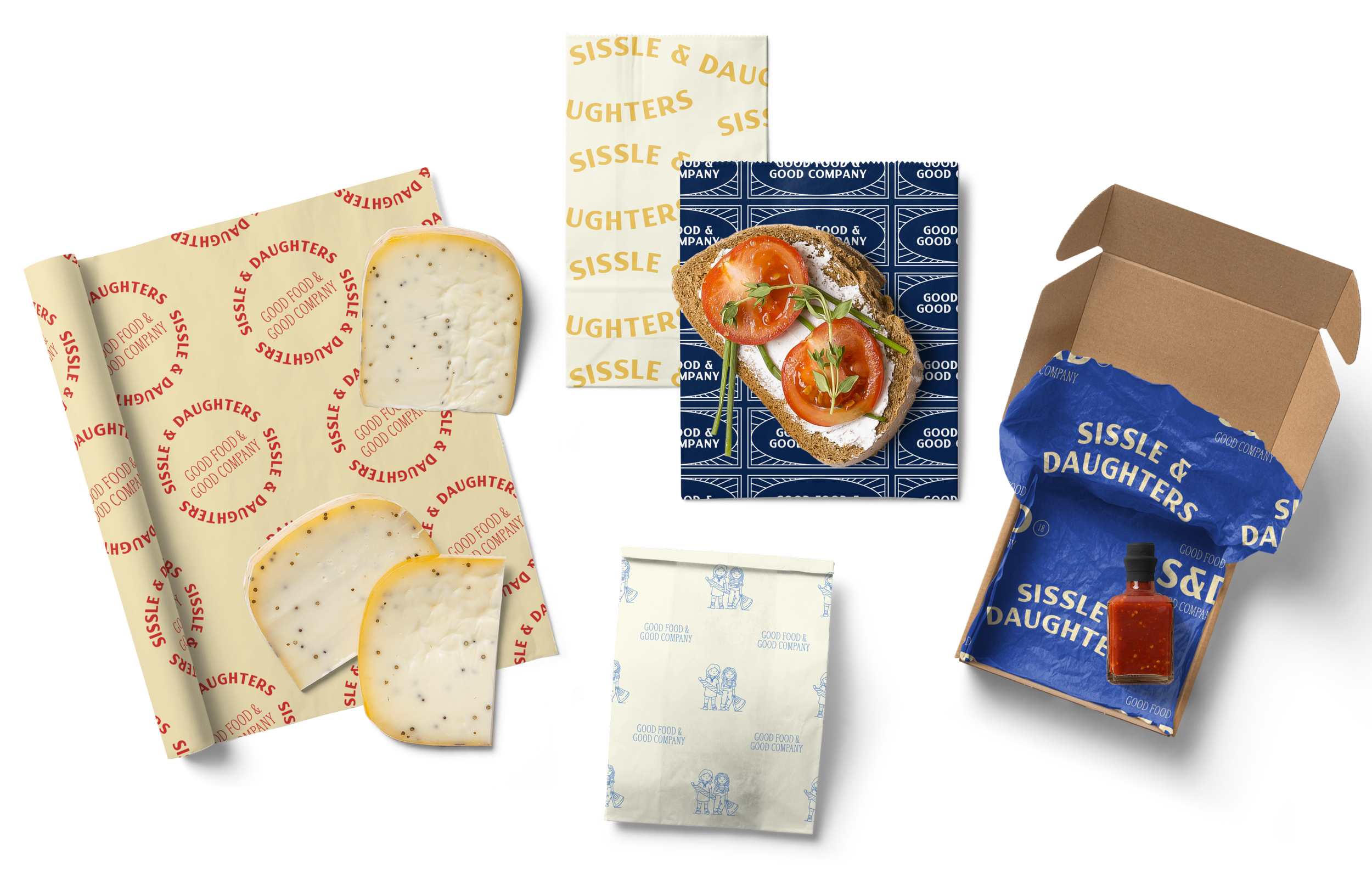
The final patterns consist of three main styles. The first is a pattern featuring custom, hand-drawn illustrations that I created for Sissle and their brand identity. It embodies who they are, what they sell, and the feeling of being in their store. The second is a french stripe, with added texture. These two patterns can be split up and used as both icons and accents throughout their branding. The final set of patterns is using their logo variations. These feel incredibly classic, and their more serious vibe can be used to balance out the playful icons and color palette!


brand guide
-
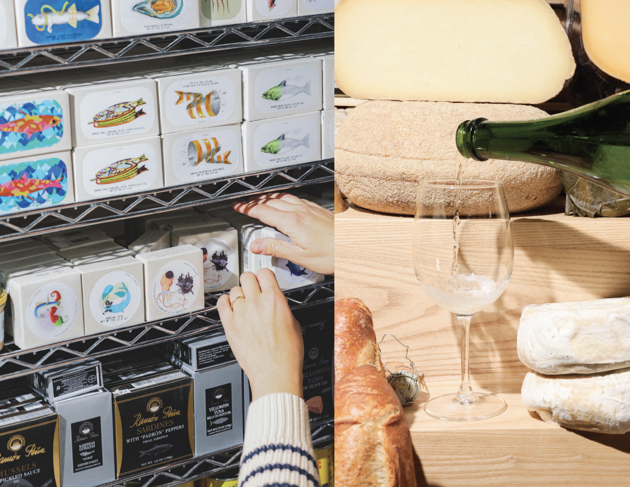
For all brand projects, we create an extensive brand guide that goes over everything we created and how to utilize it all going forward. I create them in Adobe InDesign, designing custom spreads and unique layouts for all our clients. With the copy editing help of the Creative Director, these brand “bibles” ensure we are delivering our work in a cohesive and comprehensive way. Below are a few of my favorite spreads!
Onto the next phase… print deliverables and website!
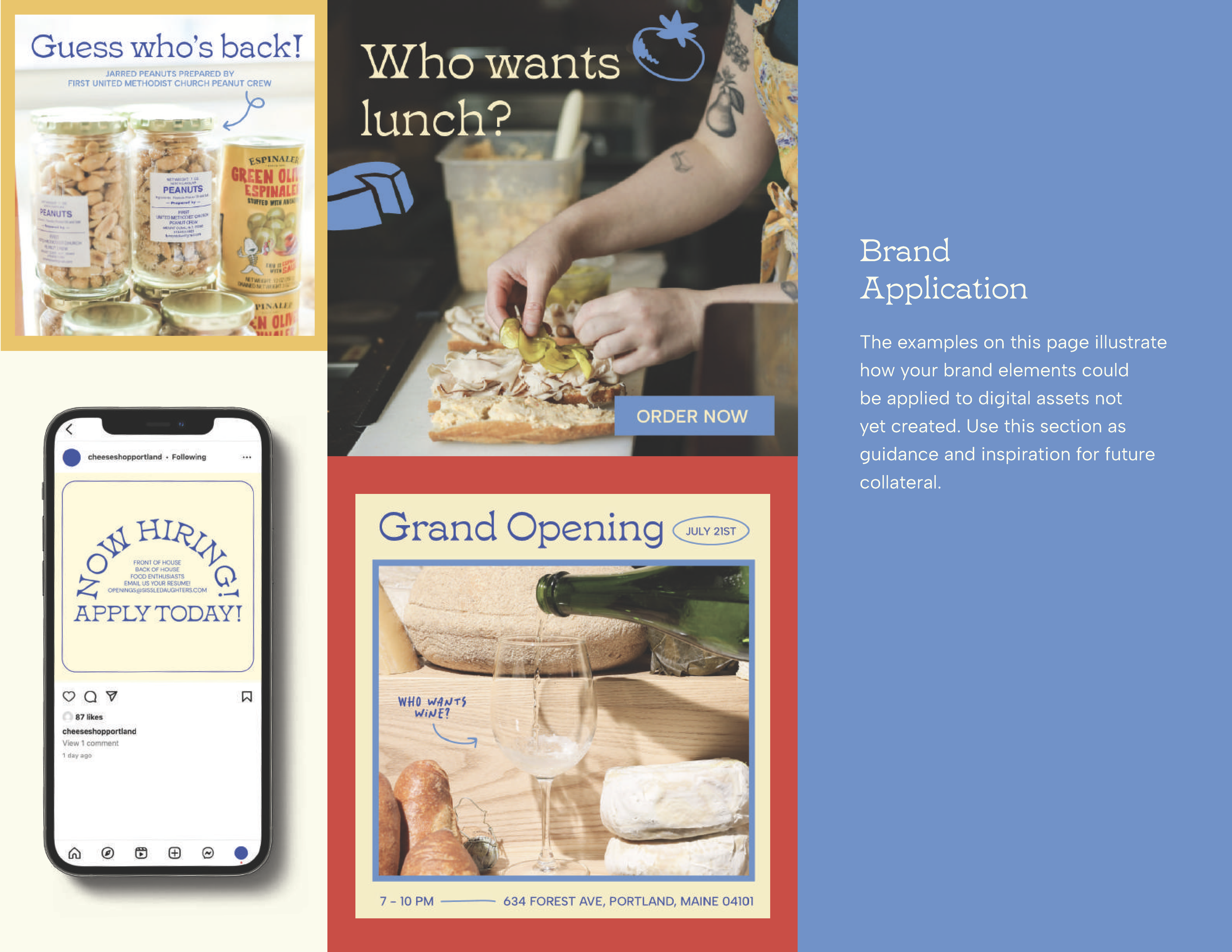
Based off of the brand guide I created, myself and my co-worker / fellow designer, Haley was able to create some amazing physical deliverables! This included but was not limited to store decals, signage, menus, hang tags, grab-and-go packaging, tissue paper, and more. Beyond the projects we completed for the clients, they were also able to take this expansive branding and create some amazing things themselves! These products are slowly rolling in, just in time for Sissle’s grand opening in November of 2024. Haley and I also worked together to design a brand new site for Sissle. Haley designed the wireframes in figma, then handed them off to me for the mockup phase! We presented these to the client, got an enthusiastic approval and sent the site over to the dev team to be built. This site is currently being built-out in wordpress and we cannot wait to see the final result! Think bold and fun.

